The 12th
LaureateArchitecture
Richard Rogers
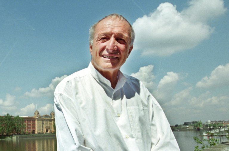
Richard Rogers’ first major building went on to become the most popular building in Europe. It was of course the Pompidou Centre in Paris,which revolutionised the concepts of façade,interior and exterior in architecture while at the same time reviving a whole district that had been in steep decline. His high-tech approach was applied later to the Lloyd’s building in the City of London,which became an instant landmark on its completion,various court buildings in Europe and the celebrated Millennium Dome on the Thames. Rogers is also a brilliant urban planner with a rare understanding of the needs of the modern and future city. This and his consideration of ecological issues when designing and planning have led to an ever-expanding sequence of sensitive yet beautiful buildings in major urban environments around the world.
Biography
Richard Rogers’ work – futuristic,vibrant,determinedly modern – is firmly rooted in history and the essential relationship of man,building and city. Both populist and genuinely popular,Rogers’ architecture exudes a lightness of spirit and touch,a sense of belief in tomorrow,that is fundamentally human. From the exuberant brilliance of the Pompidou Centre to his role as an advisor to the British Government on urban regeneration,his passionate commitment to human experience in terms of culture,playfulness and creativity has remained unrestricted by negative ideology,whether architectural or social.
Opposed to the cult of the individual,Rogers’ early collaboration with Norman Foster in the Team 4 practice resulted in the modestly beautiful Creek Vean House in Cornwall and the seminal Reliance Controls electronics factory in Swindon. This was an early essay in the social organization of modern workspace within an economical,expandable structure: managers and workers coexisted in a single environment,the structure of which was clearly expressed on the outside. As well as influencing later developments by both Rogers and Foster,this method of construction and ‘democratic’ spatial organization was to inform countless industrial and commercial spaces in the UK and elsewhere to the extent that it has become a standard building type.
While Foster began his own practice,Rogers came into contact with the brilliant young Italian Renzo Piano. Together they designed a building that would become first a cause celebre then one of Europe’s best-loved places: the Pompidou Centre,1971–77. With its services and structure on the outside,its cavernous internal spaces and escalators snaking across its glass façade,the Pompidou Centre seemed to have dropped into the relatively unadulterated streets of Haussmann’s Paris from another time and space – a place where colour,transparency,unbroken space and community ruled. Influenced tectonically by the futurism of Sant’Elia,Chareau’s Maison de Verre,certain works by Jean Prouve (who also chaired the competition jury) and the constructivists,and socially by the sense of political engagement that surrounded the events of May 1968,the Pompidou Centre immediately became the epicentre of Parisian cultural life,with its dramatic form,vast piazza and lively programme of exhibitions and events.
A similar formal and technological approach was applied to a very different end in the Lloyd’s Building in London of 1978–86. Here the familiar Rogers language of high technology materials,boldly expressed external services and transformable interior spaces was inserted into and related to the complex medieval framework of the city in a way which made London’s ultra-conservative planners squirm even after the building had become an international landmark. The Lloyd’s Building proposed a radical direction for architecture within historical cities,which led Rogers increasingly toward urban planning and social organization as the keys to creating environments where active life would be celebrated,and where the dynamic interaction of people and environment could be encouraged.
By the time Rogers’ preeminence in British architecture was recognized by his inclusion alongside Foster and James Stirling in a ‘big three’ exhibition at the Royal Academy in 1986,Rogers was showing not a building but an ambitious scheme entitled ‘London as it could be’. Earlier projects like that for the National Gallery extension,1982,had been thwarted by backward-looking authorities (although a measure of Britain’s dilemma over modern architecture is that Rogers’ proposal was voted both most and least popular entry by the general public),and he became increasingly eloquent in invoking the rich planning histories of John Nash and others to support his view of the modern city. ‘London as it could be’ was a radical proposal to re-focus London’s activities around the Thames,which had by then become empty of traffic except for the occasional refuse barge. This was as much an inversion of the status quo as was its optimistic programme for dynamic social and cultural integration during a time in which Margaret Thatcher had announced ‘there is no such thing as society’.
Rogers’ engagement with planning continues to the present day. Meanwhile the Richard Rogers Partnership itself continued to produce a series of buildings of remarkable vitality in which the twin forces of technology and community are held in dynamic suspension,particularly the Inmos Factory in Wales,1982; the European Court of Human Rights in Strasbourg,1989; Tribunal de Grande Instance in Bordeaux,1992; the Channel 4 headquarters in London,1990; and a building in the Potsdamer Platz redevelopment in Berlin,for which the master planner was Renzo Piano.
There are few architects in history in whose work the ability to fuse design with the creative needs of people has been more inspirational or more richly expressed.
Mark Thomson
Chronology
Briefly works at Middlesex County Council's architect's department
Reliance Electronics Factory,Swindon
Centre Pompidou,Paris
-
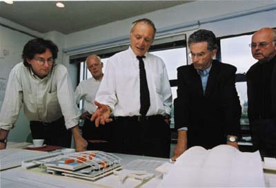
At his office, 2000
-
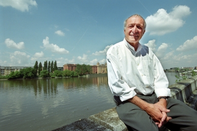
In London
-
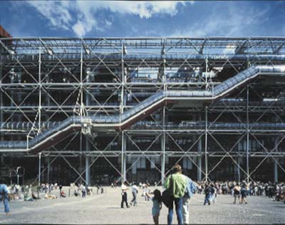
Center Georges Pompidou
-
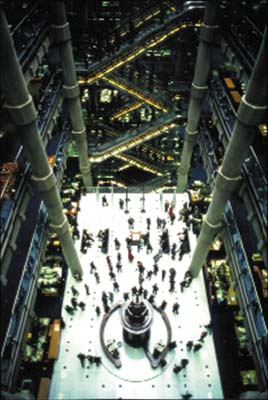
Lloyds of London
-
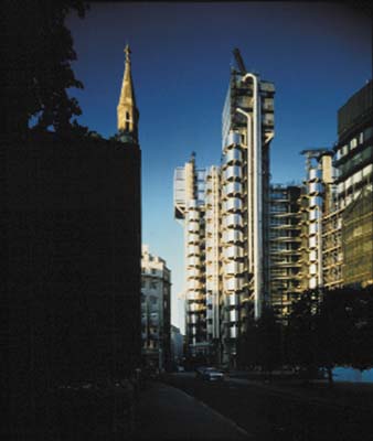
Lloyds of London
-
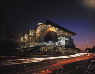
Bordeaux Judiciare
-
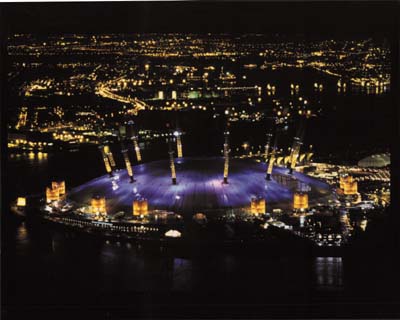
Millennium Dome
Lecture
Richard Rogers "Views on Architecture"
Richard Rogers, 2000 Praemium Imperiale laureate in architecture category, gave a commemorative lecture on October 27, 2001 at Kajima KI Building in Akasaka, Tokyo. Below is the summary:
I am honored to be in Japan and to be one of the laureates of this great international prize. I shall primarily be talking about buildings, although my work over the last few years has extended more and more into cities, urban design and sustainable development. Towards the end of this lecture, I will talk a little bit about urban planning and design.
Flexibility - dominating theme of modern architecture
The first building I will focus on is the Katsura Palace in Kyoto. =photo2= I have always felt that if there is any one place where modern architecture began, it is here some hundreds of years ago. Nearly everything you see in this palace is directly linked to the modern movement of architecture.
Instead of using gold and silver, which was typical of Renaissance architecture, the structure here is simple, using materials such as wood, paper, stone and thatch. These are all materials that depend on their quality, grain and scale rather than on richness.
Renaissance architecture is typically static. Buildings of this period were perfect when built and nothing needed to be added or taken away. The Katsura Palace however is different. Not only is it built from a flexible wooded frame, but it can also be reinvented internally. This is in fact not a building built at any one period, but one continuously altered over some hundreds of years.
What I like about this building is that it shows the possibility of a popular, low-cost form of architecture, incorporating the concept of shelter for all as well as the ideal of great art. It is fascinating to think that 350 years have passed since the palace was first constructed, and yet our concept of architecture has progressed very little. Our technology, however, has progressed in order to capture these architectural elements and flexibility is now the dominating theme of modern architecture.
For the small house in Wimbledon built for my parents, =photo3= I attempted to relate the house to the garden, and also to capture the concept of an extendible framework. All steel partitions are flexible and fluid, so that in theory they could be continuously added all the way down the garden. Two or three buildings could be put in a line.
The interior consists of mobile partitions, and the kitchen has been built very simply. Simple living was the idea I wanted to capture when I designed this house. I was also interested in the play of light, and the relationship of the house to the garden.
In contrast, contemporary Japanese urban architecture can be extremely exhilarating - practically the opposite of the first two buildings discussed as there is no calmness nor any relationship to green. =photo4= But there is a dynamic and vital quality - Japanese verticality is a very striking feature. In Western cities, buildings are much wider thus having far less grain and scale. However in Japan, the buildings are thin and vertical as is the writing system, which allows the eye to continue down a road from place to place, creating a cityscape that is full of vitality. Cities provide a meeting place and a command centre for both economic and cultural activity. The battle we have is to create a better quality of life for the majority of people who live here and to maintain the vitality.
-
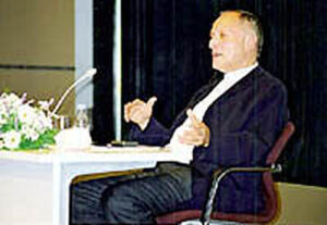 Richard Rogers
©Sankei Shimbun -
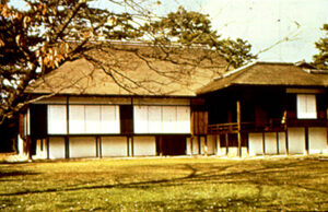 2, Katsura Palace, Kyoto
©Yutaka Shobo -
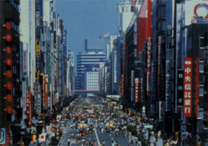 4, Ginza, Tokyo
We tried to capture this vitality when we designed Beaubourg, more commonly known as the Centre Pompidou. =photo5= The electronic age is extremely exciting and what the building tries to portray is a dynamic façade with electronics that communicate a link with art centres, cultural centres, and information centres throughout the world. It is an information centre for all people of all ages and creeds.
The Centre Pompidou is not made out of departments but is an overall cultural space. It could be called a series of loft spaces, or a warehouse for culture. A great piazza was formed outside which is for me the most exciting place. This public space continues up the building in a series of outdoor streets and corridors, sometimes glazed, sometimes open and interlinked by a great escalator of stairways leading into the sky, offering views over Paris.
Creating the public domain is a challenge for us. The user's interest in a building tends to be primarily its interior and how it functions. However the architect's role when considering the urban design of any plan is to recognise that the viewer and the passerby are also very important.
The Centre Pompidou was built in the tight matrix of Paris. At the time it was a very depressed area, but one which we felt we could drastically change. This building shows the important role architecture can have in changing an environment. It was designed so that one side of the building would be the great piazza and on the other side would be all the mechanical services. This would leave the equivalent of two football pitches totally free of any vertical element, to be used either as museums, libraries or spaces for performance. The whole concept was that it could be changed as life continued. In fact last year the Centre Pompidou went through massive change and was reorganised to adapt to 25 years of use.
The Centre Pompidou has been a great success. It is the most visited building in Europe, with about 7 million visitors per year. This building was designed by Renzo Piano, myself and the engineer Peter Rice. Architecture is all about teamwork. The importance of the building is not so much its height or width but rather its scale and grain. It is the details that give you the humanism. If we had built the Pompidou Center as a simple, solid structure it would look twice as big, so instead we broke it down into small sections of tubes. It is the play of light and shadow on the small parts that gives the building the quality of humanism.
The Centre Pompidou reflects very much the 1968 revolt of students and intellectuals. It was a very optimistic design and was intended to continue to grow, the concept being that of a fun-fair. Culture was seen as something that did not have to be elite, but could be enjoyed by everyone.
Lloyd's of London=photo6= is a very different building. Being the greatest insurance firm in the world, Lloyd's wanted a building that would firstly last them well into the 21st century. Secondly they wanted a building that was flexible and fluid, that would be able to meet their changing needs for the electronic age. They were very conscious of the tremendous changes taking place and the drastic effect this would have on their work patterns. They understood only too well that Lloyd's might become a totally different building.
It is important to mention that buildings are seldom used for the purpose for which they were designed. Change is critical. I often point out that the images we were brought up with, the functional image that a church looks like a church, a house looks like a house, are changing. For example, a very famous nightclub in Rome is actually in a church. This raises the question "What does a church look like, and what does a nightclub look like?." There is the question of frameworks and a change towards a city of frameworks. However as these are urban buildings, we still need to have an urban grain and scale.
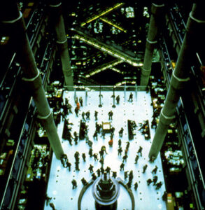
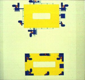
At Lloyd's, the urban grain and scale are given by big vertical towers. =photo7,8= The central area consists of loft spaces, the ten floors of work space served by six towers, which have elevators, electronics, toilets, etc. The interior is free for use and any future change.
The most important thoroughfare here is Leadenhall Street, which is where we placed the highest tower. This building provides a juxtaposition of the vertical elements that enrich the skyline. It could be argued that the fifth elevation of a building is the skyline. There is a grammar and language of architecture, of scale, light and shadow. We have to articulate the components so the building can be read like a book. When you walk down a street your eye is led from tower to tower, from piece to piece. This verticality gives you a certain lesson about the way in which one sees a building and how it unravels. When we designed Lloyd's we went to Primrose Hill which is about six miles away, from where we got an idea of how Lloyd's would look from a distance. When designing any building that involves a great vertical element, the way it is viewed from a distance is a very important factor. Its design has to be a fine balance between functional and aesthetic needs.
Lloyd's is a highly economic building in terms of energy. The air circulates between the triple glass panels and mediates between the different temperature on the outside and on the inside. This allows people using the building to work in comfort.
Lloyd's is a wonderful building because whilst the construction of the Centre Pompidou was of very low cost, here we had a headquarters budget. All the materials used here are of superb quality and have a very long life.
-
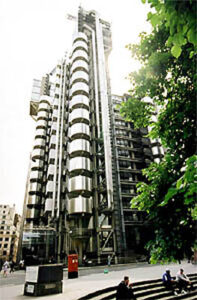 6, Lloyd's of London
©Sankei Shimbun -
 7, Lloyd's of London
©Janet Gill -
 8, Lloyd's of London
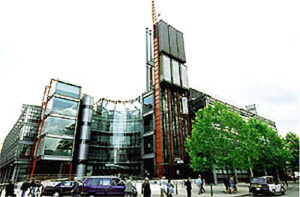
We designed a much smaller headquarters building, and one far more modest in terms of cost, for Channel 4 Television, =photo9= again in the centre of London. Nonetheless it is a landmark which signals to people that this is a major communicator with the public, with the city and with the nation. Its tower anchors the building and this verticality contrasts with the horizontal systems on each side. As this building is used 24 hours a day, we formed a piazza celebrating the prominent corner site. As I have said before, the quality of life within cities is very much based on the understanding of public space.
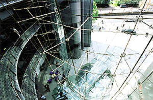
Here again, the play of light and transparency between the small garden and the glazed atrium at the top of the steps are major features of the building. =photo10= If there is one common theme it is an attempt to create a lightness of spirit. With the materials we have at our disposal today we can once more invite people into buildings. Unlike castles, built specifically to keep people out, our designs aim to attract people and draw them in through the glass. You can watch people entering the building and the excitement of activity within. The Channel 4 building is dynamic, intended to encourage an exchange both aesthetically and vocally.
Court Buildings in Europe
The European Court of Human Rights in Strasbourg enjoys a commanding position on the River Ill. =photo11= Our design was intended to reflect the importance of the institution as well as emphasise a sense of transparency. The plaza reinforces the concept of public space. People often come and sit here when cases are in session. This space functions as an invitation to participate in a judicial vision.
We have designed other court buildings, notably the Tribunal de Grande Instance in Bordeaux.=photo12,13,14= Here the seven courts are housed in wooden cylinders, each accommodating between 20 and 70 people. This is a very transparent building that encourages people to enter and walk through. The building is not meant to frighten but to emphasise the accessibility of the French judicial system and invite an understanding of the society in which we live.
The Bordeaux Law Court is a much more efficient, energy sustainable building than the ones you have seen so far. We aimed to save fifty percent of energy and therefore generate fifty percent less pollution. Below is reservoir of water which is either cooled or heated, thus acting as a mediator and a natural air conditioning device. We pass the mediated air through pipes that act very much like chimneys, and the air naturally floats up to where the people are sitting. So the whole system, both in summer and in winter, is about energy saving.
One of the nice things about this is that it does not lead you to a simple box. It allows you to separate the parts, to distinguish between the prison cells, the courtrooms, the public domain, the office building and the great democratic roof, where people can come to meet and interact. In this way the building encompasses not only negative elements of the court, but also more positive elements of society.
-
 9, Channel 4 Television Headquarters, London
©Sankei Shimbun -
 10, Channel 4 Television Headquarters, London
©Sankei Shimbun -
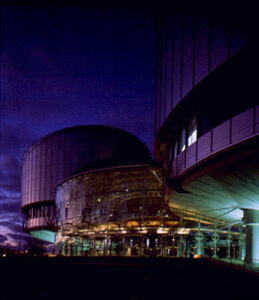 11, European Court of Human Rights, Strasbourg
©Moley von Sternberg -
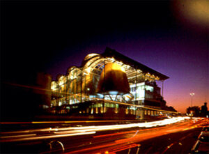 12, Tribunal de Grande Instance, Bordeaux
©Christian Richters -
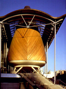 13, Tribunal de Grande Instance, Bordeaux
©Christian Richters -
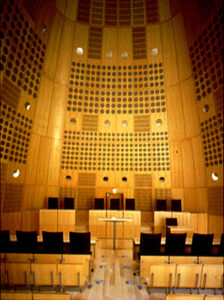 14, Tribunal de Grande Instance, Bordeaux
©Christian Richters
Our original masterplan for the regeneration of Potsdamer Platz in Berlin responded to a quite different set of problems. =photo15= Although our scheme was not adopted we were able to design three buildings within the masterplan by Renzo Piano. This area of the city was completely razed after the Second World War in order to construct the Berlin Wall and the city planners were keen to recreate the pre-war atmosphere of the area. Since Potsdamer Platz was formerly one of the busiest traffic interchanges in Europe, the present scheme has inherent problems. What is successful about our buildings though, is the mixture of shops, offices and housing. Because there is a beautiful park nearby, we cut into the square of the building to let in the light and also to get the view out from park into the centre of the courtyard. It is the typical cross-section of a city, which is live-work-leisure. The problem one has today with so many hours spent commuting, is of time inefficiency and energy-inefficiency. So our aim here is that you should be able to work and live within walking distance, or at least within local public transport distance. This old part of Berlin has a wonderful system of light railways so this area could potentially operate without cars.
The Daimler Building features a great atrium in the centre, around which are grouped offices, meetings rooms and shops. =photo16= It follows the tradition of the average Berlin block, consisting of shopping on the ground floor, three or four storeys of offices, then two or three storeys of housing. That apart, the building incorporates the latest technology which has changed drastically. These buildings are designed to use the minimum amount of energy.
Projects in Japan
Moving on to Tokyo, we designed a small office block in Kabuki-cho, squeezed in vertically. =photo17= The constricted nature of the site has resulted in a jewel of a building. It is detailed very finely and the standard of the construction is very high, much higher than European standards. The building features prefabricated toilet pods, the office area and below, the show room. The thin wedges of the building stand out when you look down the street.
The Amano Pharmaceutical Company building project was finished in the year 2000. =photo18= It was designed with the help of Kisho Kurokawa. Whatever is being worked on today is going to change tomorrow therefore flexibility is a major point to consider in architecture. So here we have a very clear and simple design, housing enzyme, biotechnology and research laboratories.
The laboratories have a strongly pitched roof and no structure inside so it is absolutely clean, as laboratories should be. The management, the restaurants and the libraries are at the top and storage space is down below. The section works extremely well, being very flexible and fluid. The structure is on the outside for this reason, to clear the space for constant change.
We also designed a virtual-reality Technology Laboratory in Gifu. =photo19= This building is dug into the hillside in harmony with the landscape. We landscaped the terraces and because it digs into the hillside a lot of concrete had to be used.
-
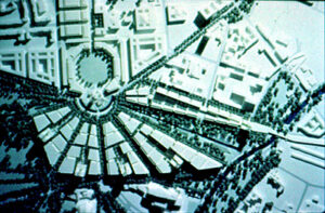 15, Master Plan, Potsdamer/Leipziger Platz, Berlin
©Richard Rogers Partnership -
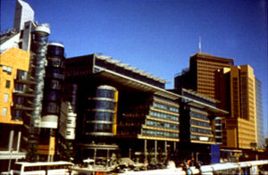 16, Daimler Benz Office and Housing, Berlin
©Richard Rogers Partnership -
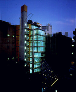 17, Kabuki-cho Project/Hayashibara 5th Building, Tokyo
©Kastuhisa Kida -
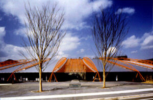 18, Amano Enzyme Gifu R&D Center, Gifu
©Kastuhisa Kida -
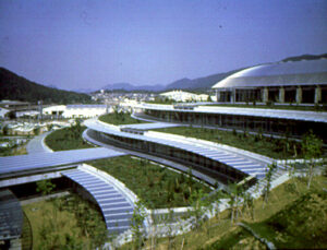 19, Techno Plaza, Gifu
©Kastuhisa Kida
The practice is not known for housing projects but in 2000 we completed a development of luxury apartments in Battersea, London. =photo20= Called Montevetro - literally mountain of glass - the scheme is adjacent to a very beautiful early 18th-century church. We did not want to put a great block directly beside it, so instead we started building from tree height and then raked upwards away from the church. Talking generally, there are two clearly different scales of height. One scale is the height of trees, which is four or five stories. This is also at a height from which you can shout down to people in the street, so a close relationship is created between the individual in the building and whoever is coming in.
On the eastern façade we used clay tiles that are typical of this part of London. The elevators climbing up this facade provide a play between the vertical and the horizontal. In this way the building offers a sculptural quality and a strong sense of articulation.
Another recent commission was the redevelopment of the headquarters for Lloyd's Register of Shipping in the City of London. =photo21= This is a good example of our attempt to work all the time towards a more transparent building. Again the building cuts into the skyline with the verticality of the lift and the offices are in the form of three tall wedges. It is a very tight and limited site typical of London so the shape is very much dictated by the neighbouring skyline.
We have also recently completed which was to have been the headquarters for Daiwa Europe but was subsequently completed as a speculative office space.=photo22= Now known as 88 Wood Street, it is another example of our attempt to include public space on the ground floo, consisting of cloisters, a big entrance area and elevators. The façade is simple and transparent, using 'white' glass. This is a moderately low-cost building for renting, consisting of a simple slab block and tower.
Millennium Dome
The Millennium Dome at Greenwich in London was a tremendously successful job for us.=photo23= It was started nearly four years ago under the Conservative government and continued slightly differently under the Labour government. Not only were there two governments involved but neither of the governments knew what they were going to put in it. Buckminster Fuller, the great American engineer, often enthused about the concept of enclosing parts of the earth with lightweight structures. Following his example, we built an umbrella, a big umbrella to fend off the notorious British climate.
The UK press savaged the contents of the Dome - the exhibition 'zones' - but we should remember that we are living in an age where the content of a building becomes less and less relevant as its purpose is in continual flux. Thus, the need for flexibility is the only constant.
The Dome is supported by twelve one hundred metre-high masts. It measures 330 metres across, one kilometre in circumference and is one of the largest lightweight enclosures in the world. It is made of a lightweight material - teflon-coated fibreglass - which has a life of about 25 years. However the overall building is very low-cost, about £430 per square metre. Because of the way it is constructed it went up very quickly and was actually cheaper than we had expected, costing about £50 million.
Commanding a wonderful position on a curve of the River Thames, right opposite Canary Wharf, the building's future is still uncertain. The Dome, with suitable maintenance, could have a long life but we shall have to wait and see what its next purpose might be.
-
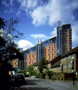 20, Montevetro Housing, London
©Kastuhisa Kida -
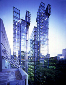 21, Lloyd's Register of Shipping, London
©Kastuhisa Kida -
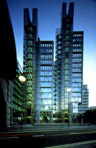 22, 88 Wood Street, City of London
©Kastuhisa Kida
I shall now talk a little about urban design. I have to say that I am rather conscious of the general lack of spaces in between buildings. Perhaps in Europe, there is a greater tradition of space. For example, plans of Rome in 1780 show two-thirds of all space was public space with only one-third used for building. Now with cars, privatisation and a lack of interest in public space, I do not think we could talk of any city being like this. That said there are a few notable exceptions, such as Barcelona, which is probably the jewel of European urban regeneration. Barcelona, which had all the typical problems of an industrial city, has transformed itself into one of the most dynamic and visually appealing cities in the world. Typical of the broad vision of the city planners was the decision to simply move the old port area and create in its place eight kilometers of vibrant waterfront.
It can be done. It just needs willpower, wonderful designers and competent contractors. You can also see similar results in Holland, Copenhagen and in Italy. In Italy once a month many of the cities now close off their roads to traffic. Suddenly people are once more regaining control over their city rather than the city taking over the people.
What this all boils down to is the definition of a real city-state. When looking at a country, people no longer see the border but only the light of the town. We are again beginning to see city pride and power. I think it is very difficult to identify with a large region or a large country but it is perfectly possible to become part of a city community. This is much easier on a small scale than on a large scale, which is why I believe strongly in the constellation and interrelationship of cities in the network of society.
I was appointed some three years ago by the present British government to lead an Urban Task Force. I produced a report called "Towards an Urban Renaissance". The concept was to identify causes of urban decline, to recommend solutions that will bring people back to our cities, to establish a vision for urban regeneration founded on the principles of design excellence, social well-being and environmental responsibility, within a viable economic and legislative framework. This report has over 105 recommendations.
The recommendations all aim to create a more compact city. A critical part of this is that we should not be building on green land but instead should be reinforcing the existing city structure. We must re-use used land that is often industrial and polluted. We have to stop shopping centers and business parks being built outside cities and instead emphasise the compact nature of the city. We want compact, polycentric, well-designed cities, without losing any further tracts of green land. The British government has now agreed that the majority of all land to be used for future housing and activities will be within cities.
Key points for successful urban regeneration are:
Diverse Activities:by this I mean work, living and leisure, all within easy walking distance of each other.
Connectivity:this means good public transport, but also good planning so that people can meet easily in the street. The street is where you meet first and foremost, then the square and the park.
Ecological awareness:we have a long-term duty to our globe which we are currently polluting and destroying. As was so clearly defined in the Kyoto Conference, we have a responsibility, particularly the richer nations, to look after our earth.
Good design:good design pays. A house which has been well designed will go up in price much faster than one which has not.
Economic strength:cities are economic command centers.
Good governance:this means clear governance and also participation. Every city should have an architectural center where people can participate in the planning and design of their cities. This is a very important part of good governance. Social inclusion is also important as we are suffering drastically from social exclusion and city fragmentation. The greatest difficulty I have had in my work for the government has been to explain that these two factors go hand in hand. It is no good pouring money into the Health Service and schools if the fabric of the city is not repaired. If everybody is trying to escape the city, then putting money into these areas will not help. So we have to build a beautiful looking city as well as have social programmes.
Ecology:the only energy the earth receives is through the sun. The world is a living organism, just like the pith of a tree; the bark is alive as well as the pith. We have to try and use what energy comes from the sun which is wind, water and land mass, instead of using carbon-based fuels. Buildings use some 75 percent of all energy, 25 percent of which is related to industry. With the problems of ozone depletion and global warming we need to minimise the amount of pollution caused by industry.
-
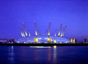 23, New Millennium Experience, Greenwich
©Grant Smith
I am about to start a new job as London's Chief Adviser on Architecture and Urban Design. Our biggest commercial development in London over the last ten years has been in Canary Warf and along the Thames. At the moment, just behind the Dome we are building a new town with a park in the middle and a light railway which runs along the edge of the park. Everybody can get to the central part within a minute of their house and from the nearby station they can take the Jubilee line and reach the centre of London within 14 minutes. This town is very much public transport-based.
In all the buildings I show in London as well as in Europe, we have cooling systems. Air conditioning is not used any more in the buildings we design as it uses so much energy and causes so much pollution. We have to try and find a way of minimizing the amount of air conditioning. Of course it is much more difficult in those countries where you have a humid climate. But it is a question of thinking your way through the alternative systems that we can use to cool rather than to use the simple, cheap methods such as carbon-based fuels which are gradually destroying the earth.
I would now like to talk briefly about two other projects I have been involved in.
We were involved in a project eight years ago in Shanghai. Our objective was to house half a million people in the Pudong area. Based very much on sustainable development, it consists of six communities with 80,000 people living in each one. We incorporated a train service which linked each of these communities together and a lightweight train around the central park so there would be easy access to the water supply. Here you have the concept of live-work-leisure, low energy, and good transportation.
In Florence we helped design the Castello Extension. The idea for this is very much based upon ecology. Its main feature is a large pool of water in the centre of the site. The idea being that the breeze moves the coolness across the town in order to minimise the amount of energy used.
I should now like to talk a little about our own office. We have an office of about 120 people; two-thirds of these are architects and we have 11 directors. I have had the fortune of working with an immense number of highly capable people throughout my life.
Part of our office is made up of converted old buildings, and some of the office meetings are held here. Meetings are often attended by the clients at the same time. Basically Mondays are design days, where we concentrate purely on our designs. We pin up drawings and then discuss them with whoever wants to come into the room.
We also have the wonderful "River Cafe" and bar where my wife is the chef. Again we have a place where we can sit and talk. Here once again we have an exchange of ideas, the contact with people. Public space is the heart of our community and the heart of a vital city.
-
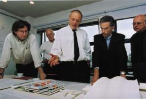 Rogers at his office
©Sankei Shimbun

