The 14th
LaureateArchitecture
Norman Foster
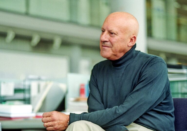
Norman Foster was born in Manchester in 1935. After graduating from Manchester University School of Architecture and City Planning in 1961,he completed a Master’s Degree in Architecture at Yale University. His architecture is universally admired for its conceptual and structural brilliance and "high-tech" beauty -a special union of technology and aesthetics that has been polished and perfected over a lifetime. His works combine advanced technology,an ingenious geometry,attention to detail,and sensitivity to ecological considerations. Recent commissions,especially the Sackler Galleries and the Great Court of the British Museum,both in London,and the new German Parliament at the Reichstag in Berlin,add a new quality to his work. Although uncompromisingly modern in character,they demonstrate a great respect for the past.
Biography
Norman Foster was born in Manchester in 1935. After graduating from Manchester University School of Architecture and City Planning in 1961,he won a Henry Fellowship to Yale University and completed a master’s degree in architecture. His architecture is universally admired for its conceptual and structural brilliance and “high-tech” beauty – a special union of technology and aesthetics.
A leader and innovator in the uses of new materials and methods of construction,Foster has created a distinctive style. Many of his structures are already landmarks of the building art. In a practice spanning almost forty years,he has completed at least one hundred commissions worldwide. These include museums,cultural centers,institutional and corporate headquarters,schools,housing and transportation structures from huge airports to subway systems.
Foster’s works such as the Hongkong and Shanghai Bank Headquarters,the Sainsbury Centre for Visul Arts in Norwich,the Passenger Terminal at the Third London Airport in Standsted,the Commerzbank Headquarters,Frankfurt,the Hong Kong International Airport,or the Century Tower in Tokyo,combine advanced technology,an ingenious geometry,attention to detail,and sensitivity to ecological considerations. Foster’s recent commissions,especially the Sackler Galleries and the Great Court of the British Museum,both in London,and the new German Parliament at the Reichstag in Berlin,add a new quality to his work. Although uncompromisingly modern in character,these celebrated reconstruction projects demonstrate a great respect for the past.
One of Foster’s major contributions has been the creative reconfiguring of the skyscraper. He has rejected the standard structure of office floors surrounding a service core by moving the core to the periphery. This provides open,flexible space that can be manipulated for more efficiency – angled around a unifying open atrium,set back to form park-like terraces for the office floors,or,as in the case of the Hongkong and Shanghai Bank,the whole building can be raised on boldly visible stacked trusses to leave a public space at ground level. The innovative and attractive results also offer those who use the buildings the opportunity for connections and communication far beyond the formulaic impersonality of the ordinary high-rise.
Foster is remarkable in the length of his career,his exceptional productivity,the structural and stylistic standards he has set,and his profound influence on the way cities and buildings look today.
Chronology
New German Parliament,Reichstag,Berlin
Life Peerage in the Queen's Birthday Honours List,Lord Foster of Thames Bank
Awarded the Praemium Imperiale Prize for Architecture,Japan Art Association,Tokyo
-
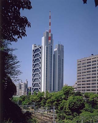
Century Tower
-
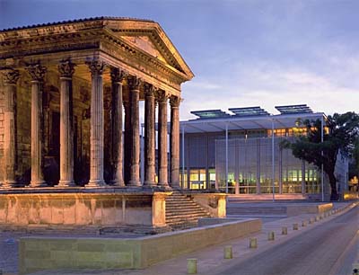
Carre d'Art, Nimes
-
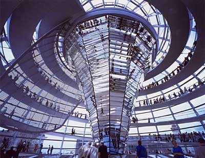
New German Parliament
-
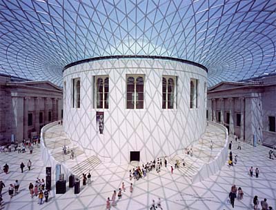
The Great Court at the British Museum
-

Millennium Bridge
-
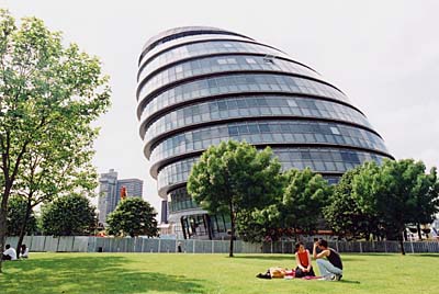
Greater London Authority Headquarters
-
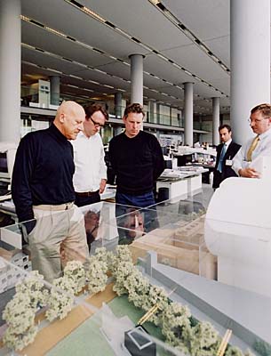
At the studio on the Thames
Lecture
Norman Foster "Views on Architecture"
Norman Foster, 2002 Praemium Imperiale laureate in architecture category, gave a commemorative lecture on October 25, 2002 at Kajima KI Building in Akasaka, Tokyo. Below is the summary:
Thank you, ladies and gentlemen. I want to first thank the Japan Art Association for making this event, and the events of this week, possible. It's been a great honor to be here.
Our Challenge
I'd like to talk about some of my interests, which I share with my colleagues, and also reflect back a little on an earlier career as a student. Let me start with what we see as a challenge, which I think we all share, whether we're architects or not. It is the reality that the earth is a finite planet, with less land and more people,. It’s really quite a daunting challenge, then, to achieve higher density and, at the same time, to improve the quality of urban life. That I think is true whether it is a new world city -- whether it's one of those rising mega-cities of the Pacific Rim -- or whether it's the more historic European city. So, one of the fascinations is the way in which cities regenerate -- old buildings are given new leases on life, regenerated in turn.
I'm also fascinated by infrastructure. I could argue, perhaps, that the infrastructure of a city -- the routes, the public spaces, the connections -- is possibly more influential in terms of the quality of urban life than the quality of the individual buildings, whether one happens to live in the city or visit that particular city. Given, too, the reality of pollution and the depletion of various sources of energy, the ecological balance is also something that has fascinated us over many years, even before it became a kind of fashionable -- not " fashionable," but the realization that it is very much about survival. And in terms of energy, probably buildings are consuming about half the energy in the world today.
If I go back in time to my early years in the practice of architecture and look at snapshots I accumulated, the themes occur. They are the images of the European cities like Vienna, the new world cities, the twin-tower site of New York -- anonymous structures, architecture without architects-- I'm fascinated by anonymous architecture; some of the earlier pioneering works, the glass architecture, the palm houses, the anonymous shading devices - a fascination with Japanese architecture because of a passion about light, the humanizing qualities of natural light; the ability for light and view, or translucence, to bring a human, poetic dimension to spaces. And also flight. Interestingly, the sail plane is probably the ultimate solar machine, in terms of extraordinary performance totally generated by solar power.
So these themes of public space, the infrastructure, the way the city and the individual building relate, were a very early fascination. Those themes weave in and out of the projects. If I take the Reichstag as an example, the crucial decision on public space was not in the competition brief, but came out of advocating to the political body the importance of public space, and of a new relationship between the public and the politician.
Literally, the building is drawing the crowds -- something like three and a half million a year, who queue for many hours -- to ascend the building to the public realm on top. This cupola, as I'll describe, is not only a symbol, but it’s very much part of the energy story of the building, the ecology of the building. Extraordinarily, probably the most popular restaurant in Berlin is situated on the roof. People can look down directly into the chamber below. Natural light reflects on the mirror directly into the chamber. The sunlight is quite welcome in the winter, but is a source of heat in summer, so there is a shading device, which is computer-controlled to block out the sunlight.
There is another dimension to light, and I don't mean the physical light. I mean the challenge to make the building more transparent, to somehow shed off a lot of the imagery and history of this rather forbidding building, literally opening it up so you can see east to west. People gather up there; in between is the press lobby; seeking is a new relationship between the political bodies and the public, - a beacon of democracy working, visible on the skyline.
The energy story is quite interesting. It’s really a mini-powerhouse for the whole quarter. Electricity is produced very cleanly from the burning of vegetable oil, oil from plants, sunflowers, rape or date. The waste heat is converted into cooling. Carbon dioxide emissions have been reduced by 94%. There are solar panels on the roof. And the excess heat in summer is dropped in hot water 300 meters down into an underground lake, which becomes a thermal source for heat in the colder time of the year.
It’s very important, as well, that the scars of war remain on the walls, the history of building - they were not covered up. There are memories of the Russian occupation, graffiti, 19th century carvings, some by the original masons - all of these are part of the story of the building over time. The cupola on the skyline has become emblematic of Germany, of Berlin, and grows really out of that infrastructure of routes.
New London Parliament
Another smaller building, the new London parliament, takes the idea in a new building of a route that will take you from the base of the building to the most public part through the working space of the administration. A spiral connecting the political chamber at the base also takes you to the public space.
-
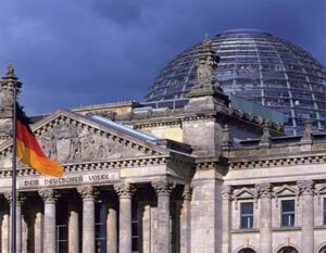 New German Parliament, Reichstag, Berlin,
1992-99.
© Foster and Partners -
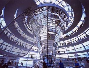 New German Parliament, Reichstag, Berlin,
1992-99.
© Foster and Partners -
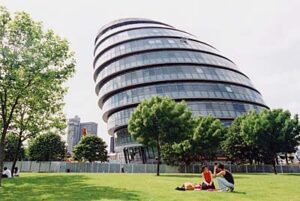 Greater London Authority Headquarters, London, 1998-2002.
© The Sankei Shimbun 2002
The same approach in terms of the relationship between public infrastructure and the individual building is seen in the project in Nimes. The site of the new building faces one of the most beautifully preserved Roman temples. So new museum Carre d’Art is very special to its place. We move around thinking of building it in different locations. We work with local collaborators in hope of the temple resuscitated with the new building being built. Each building really come out of its context, the spirit of the place. It is not merely a physical structure.
That really came out of many visits, a lot of sketching, a lot of questioning about the project. And in the end saying that it's not just about a building, it was very much about a site. As I thought this was the subject of a competition and what the client had in mind, I include this image and I decided to talk about it here because it's a reminder of the importance of the client. The creative involvement of the client is the driving force behind every project. The political dimension is quite considerable. In this case, the mayor, Jean Bousquet, finally got state funding, matching funding, through political efforts on the basis of its being a project to revitalize, redevelop, the whole city. It was about regeneration, urban regeneration. When we compare the past with the present, one of the constants is the 200-year tree on the corner. But the metal railings around the historic temple and the parked cars were taken away. The Roman paving has been reinstated, and a cafEwas built. Now there is a new urban life instead of the desolation, and there is constant dialogue between the new building and the historic temple. The public space, a kind of outdoor living room for the city, for events, was created. And within the building the different cultures in the city are brought together - the performing arts, information, the galleries - and with the glass staircase pulling light down deep into the base of the building.
Stanford University (California, U.S.A.)
Moving now from the south of France to another Mediterranean climate, the west coast of America, and to Stanford University. The traditional form of a medical research building, a kind of closed box, being cut through and pulled apart to create a main movement pattern and an internal space, a sort of social focus, which would bring light, but most importantly, would bring exchange between the different specialties which live in the closed worlds of their own specialized communities. If you talk to Nobel Prize winning scientists in the fight against disease, medical research, they all seem to feel the same way, that the medical breakthroughs are not made in the traditional research spaces, but they happen when the specialties come together over coffee, in a bar, over a meal.
-
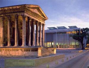 Carré d'Art, Nîmes, France, 1984-93.
© Foster and Partners
If we talk about higher densities, inevitably it means, in urban concentrations, building upwards. We've explored, and continue to explore ways in which the high-rise building might be made more interesting, humanized. How do you break down the scale of the very tall building? And, in a way, we have questioned the traditional form of an office building, which traditionally has a series of solid cores in the middle, which take the staircases, the elevators, the mechanical plant, the toilets, and leaving a small band of perimeter space and those sort of identical floors.
Among some of our tall structures the Hong Kong bank, for example, has a kind of gardens in the sky, reception points. So you have high-speed elevators that take you to maybe the cafeterias, the meeting areas, and then by escalators down. The solid core in the center was pulled out to the outside, allowing more flexible space.
The roots of this building, pointed out by a colleague at Yale, lay in a student project I did in the master's class at Yale in the early '60's.
In terms of the integration of structure, services and space in the tall building, natural light is pulled into the deep space by using mirrors to bring to life the public space underneath, thus engaging the building into a public domain. The old building, the one that was replaced, was really very typical of a bank, presenting quite a solid face to the public, as opposed to the new building, which really opens up. In that sense, the building is like a bridge over the space, an exceedingly popular space at weekend in this city that has such a scarcity of public space.
Commerz bank Headquarters (Frankfurt, Germany)
Moving on to another example, we have the Commerz bank headquarters in Frankfurt. At the triangle corners are the cores, and then the gardens spiraling around. It wasn't intended to be the tallest building in Europe, but it ended up being. More significantly, it is the first ecological high-rise, in the sense that it's a controlled climate, but the access to fresh air and natural ventilation for more than fifty percent of the year means that, in energy terms, it uses less than half that of a conventional air-conditioned building, and with a much greater degree of user satisfaction.
The gardens break down the scale and become meeting points - coffee areas. In the morning, lunchtime, they serve the larger community of the city as well as the occupants of the bank. At night they become a kind of late-night dining and bar area, after the building has closed down. In addition to its formal bank entrance on the other side, it does have this very interesting relationship with the city, with its own contained entrance, so that you can take a shortcut from one side of the urban block to the other.
-
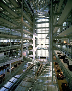 Hong Kong and Shanghai Bank Headquarters, Hongkong, 1979-86
© Foster and Partners -
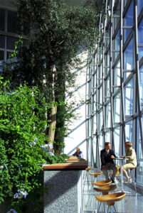 Commerzbank Headquarters, Frankfurt, 1991-97
© Foster and Partners
In the Sainsbury Art Centre, at the University of East Anglia, under one roof rather than in separate buildings are the temporary galleries, the permanent galleries, the senior common room, the meeting place for university staff, and the faculty, the school of fine arts. And that building, served from below by a ramp, is to produce an exercise in flexible space and controllable, natural top-light, which was, in a way, a stepping stone to our challenge of the then traditional airport as a concept.
Stansted Airport (London)
This is the third London airport at Stansted. For the first time in an airport, the roof is opened up to natural light and all the things that normally drive, power, cool and heat a large space are put below the concourse. Traditionally, before this building, an international terminal, if you walked on the roof, was like this, full of mechanical plant. Terminal 4 at Heathrow, for example, would be typical of any at that time, in the 1980's, and any potential for natural light is blocked out. Stansted literally turned that upside down, with all this mechanical plant going below. The roof is completely free for natural light, for sun; dramatic energy savings but also far more beautiful in terms of the quality of the light. And that heavy machinery that used to sit on the top go below and is now in a really more sensible place, with limited life. You need to change it, you need to get at it, so having it on the roof is really not an ideal place - far from it.
And then, in terms of integration, the main railway station is not a separate building, but directly below. It has its own internal road so that trucks, for example, can service the equipment. Security is ensured. The baggage systems are below, exactly where they need to be.
Hong Kong New International Airport
And that's been a model, really, for international airports since then, including our own in Hong Kong, on a kind of epic scale - 18 hectares - under the same concept. Although it is a very huge building, it’s a compact building in a way. It’s the equivalent of, for example, at Heathrow, four and eventually five separate terminals, and people move effortlessly. It has its own shopping center within it, really on a large scale. With the excellent rail link, the infrastructure between the city and the airport, it serves the city - is really a kind of mini-city - with the highest rental rates in Hong Kong and the lowest vacancy rate. The baggage hall is below the shopping center, roughly the same size as Yankee Stadium or Wembeley Stadium.
One of the challenges is, how do you make an airport on this scale feel more accessible, feel more friendly? I call this, in a way, an attempt at a digital building. If I look at a clock face, I have an immediate sense of time; I don't have to translate numbers or zones or colors. And so, in my ideal airport, I can look out one side and see the mountains; in this case I can look out the other side and see the sea. I can look through the window and see the aircraft. In that sense, it signals time, place, orientation.
-
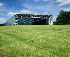 Sainsbury Center for Visual Arts Norwich, England, 1974-78
© Foster and Partners -
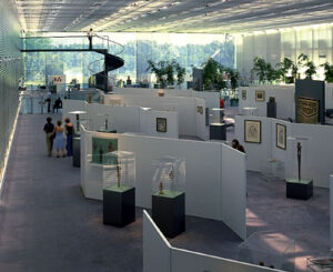 Sainsbury Center for Visual Arts Norwich, England, 1974-78
© Foster and Partners -
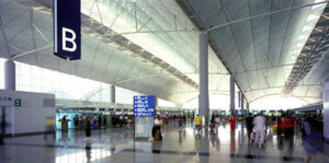 Hong Kong International Airport, Chek Lap Kok, Hong Kong, 1992-98
© Foster and Partners -
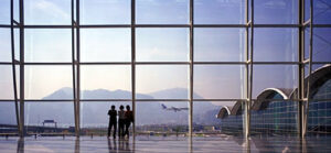 Hong Kong International Airport, Chek Lap Kok, Hong Kong, 1992-98
© Foster and Partners
Let me now mention a few projects in London, which is our base of operations, although whenever we do a project we will move a team out with that project. Wherever it is - if it’s in a Malaysian jungle or if on the west coast of America - there will always be a small team that will live with the project to completion.
The Millennium Bridge is another good example to show what an important role infrastructure plays. The bridge connects the traditionally rich area of the city, historic St. Paul's, with the poorer area, in this case, the recently realized Tate Modern Gallery on the opposite bank. There was a gap before the bridge, but, interestingly, after the bridge went in, a ripple effect from the bridge had the power to regenerate the wider area. You can see the quite dramatic effect of that single bridge on the area.
Visually, of course, it is unusual, in the sense that it is a suspension bridge in which the tension elements are very, very low. So in its physical bulk it is very minimum - a kind of re-evaluation of the nature of a suspension bridge. As with all of our projects, it’s the fruit of collaboration with other specialists, with brilliant engineers, and in this case also working with a sculptor, with an artist.
World Squares Project (London)
Another area we've examined is called World Squares, an area of London that is, on one side, the river, and on the other, St. James's Park, Horseguards Parade Park; the National Gallery, Trafalgar Square to the north, and to the south the Houses of Parliament, on the southern edge. The aims of that study were to improve the access, the quality of urban living, the setting for the many historic buildings, and to improve public transport. It was like walking a tightrope, a balancing act between competing forces: the need to improve access, but also to respect security; to acknowledge private cars, but to enhance public transport; to respect the needs of tourists, versus Londoners'; and so on. And really you can say that any city is always in a process of adjustment, of rebalancing. And so, the aim here was, by making small interventions in the city, to improve the quality of urban life.
And that was rooted in an extraordinary amount of research, which, interestingly, contradicted everybody's assumptions. Even the written brief assumed that there would be 60 percent visitors in the area. The reality is that it was 60 percent Londoners and some 40 percent visitors. 27 thousand drivers were questioned. In terms of pedestrians, there were nine control points and 169 of these observation points. There were public exhibitions; there were questionnaires. And over 80 percent of those petitioned were positive on the need for change in the area. So there was a tremendous amount of public consultation.
This was the pavement on the north side of Trafalgar Square - very dense. Surprisingly, the pavement on the south side was virtually empty. This kind of thing happens depending on conditions, like people trying to cross a road at a crossing, for example. So, in terms of seeking to rebalance these spaces, the conclusion finally came out in support of closing this road to traffic, making it for pedestrians, to improve the movement diagonally through and across the square. The construction is now very advanced; already it improves the setting, brings the heart of the square to life. It's a minor intervention, but the effect, in terms of the city, is very considerable and pleasant.
Similarly, at Parliament Square, buses now block an important city view. If that is given over to people, to fountains, then it really will be quite a dramatic improvement. That is the next stage. Just before this project started, when we won the competition, we were successful in working with the media to draw attention to the appalling situation in Horseguards Parade, and I was successful in bringing public opinion together to say, "let's get the cars out of this space". And it's interesting; it was very controversial at the time - caused a lot of interest, excitement, argument, debate. But of course in no time at all everybody has forgotten that. And if you ask somebody to remember when it was a car park, they probably would not remember.
-
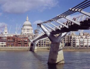 Millennium Bridge, London, 1996-2000.
© Foster and Partners -
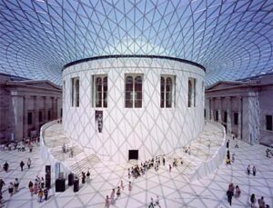 The Great Court at the British Museum, London, 1994-2000.
© Foster and Partners
The final scheme in this group of London projects is the British Museum. It was very difficult to enter this museum, which was designed, created in the middle of the 19th century for a few hundred people. Now, alongside the Louvre and the Metropolitan Museum in New York, it shares a similar number of visitors a year - around six, six and half million. With those numbers, to get from one gallery to another, it's a bit like Trafalgar Square was; you really had to fight your way through one gallery to get to the other.
In the heart of the museum was the round reading room, the great reading room, where there were all the book stacks. When the British Museum was created there was a courtyard, but Smirke's brother - Smirke built the original museum - put the round reading room in the middle of this garden seven years later. So, really, the idea of a courtyard at the heart the museum is something from its history, but only very briefly in its history. What we proposed was to remove these buildings and to put a kind of very delicate glass umbrella on top of it. The idea was that it would work as a part of the city; so, out of museum hours you would be able to come through the entrance, meet in here, maybe enjoy a performance; it would have its own temporary exhibitions; it would have a bookshop, cafes, a restaurant; you would be able to take a shortcut through the block. And then during museum hours you could come in and you could access the individual galleries easily. It would have a public space that was appropriate to the number of visitors and the importance of this cultural institution.
Finally, currently, all of those concerns focused among other projects at the moment with the issues of the World Trade Center. I think the idea will be that, at the end of this process, which will finish at the end of next month, the efforts of the different teams will somehow combine together in terms of tackling the issues; learning, listening, listening to the family groups. And, really, it, in turn, being a manifesto, which perhaps starts with the opening sequence: the challenge to regenerate, to create high density, to reevaluate the cultural dimension of the site, the memorial dimension of the site, and to finally balance all those conflicting factors, and to reconcile the quest for density with quality.

